Does Resizing Before Compression Beat Compression Alone?
10 photos × 4 widths × 5 quality levels, measured. The headline answer is yes — with a 12× file-size gap at equal visible quality. But the full-resolution route has a hidden quality advantage nobody talks about.
The Question
You have a 1600×1200 photo. It will finally be viewed at 800 pixels wide — on a blog, in a chat, in a product listing. Two strategies:
- Strategy A — resize first: downscale to 800px, then compress.
- Strategy B — compress only: keep 1600px, compress, let the viewer's browser shrink it at display time.
General advice says "resize first, always". But is that actually true when you measure what the viewer sees against what the viewer downloads? And how does the quality slider interact with image width?
Method
Test set: the 10 photographs from Studies 01–02 (1600×1200, real-world photos). Other content types were excluded: resizing is a photo decision; documents and flat art should stay lossless regardless (see Study 01).
Resizing: HTML5 canvas with imageSmoothingQuality: 'high' in Chromium 151 (Windows 10) — the same high-quality path our Resize tool uses. Target widths: 1600, 1200, 800 and 400 px.
Fidelity metric: for each target width we built a lossless downscaled reference (the pixel-perfect ideal at that width) and computed SSIM against it. This measures what the viewer actually sees at that width — not the original pixels, which are gone the moment anyone decides the image displays at 800px.
Strategy B honestly evaluated: for the "compress only" route we took full-resolution JPEGs and simulated display-time downscaling with a high-quality Lanczos resampler, then measured SSIM against the same per-width reference. One caveat: the full-resolution encodes for this comparator were produced by Pillow's libjpeg-turbo (quality scale within a few percent of Chrome's canvas encoder); all Strategy A files were encoded by Chrome itself, identical to Studies 01–02.
Raw data: r3-results.json.
Results 1: File Size Scales With Pixels, Not With "Quality"
Mean file size at quality 70, by width:
| Width | Mean size (Q70) | vs 1600px | Pixel count ratio |
|---|---|---|---|
| 1600 | 191 KB | 1.00× | 1.00× |
| 1200 | 104 KB | 0.54× | 0.56× |
| 800 | 52 KB | 0.27× | 0.25× |
| 400 | 16 KB | 0.08× | 0.06× |
File size tracks pixel count almost exactly — halving the width cuts the file to roughly a quarter. No quality setting can recover that: our most aggressive quality reduction at 1600px (Q50) only reached 0.77× of the original, while simply delivering at the right width does 0.27× at high fidelity. Width is the strongest compression lever there is.
Results 2: The 800px Showdown
Everything below is measured at what the viewer sees at 800px wide (SSIM against the lossless 800px reference):
| Quality | A: resized→800 | A: SSIM | B: full-res file | B: SSIM displayed |
|---|---|---|---|---|
| 50 | 37 KB | 0.9377 | 161 KB | 0.9767 |
| 60 | 43 KB | 0.9455 | 184 KB | 0.9861 |
| 70 | 52 KB | 0.9550 | 198 KB | 0.9916 |
| 80 | 67 KB | 0.9659 | 214 KB | 0.9928 |
| 90 | 103 KB | 0.9803 | 290 KB | 0.9936 |
Two honest findings, one expected and one not:
- The expected one: at any reasonable fidelity bar, Strategy A wins on bytes decisively. To display at ≈0.98 SSIM you can ship a 103 KB resized file (Q90) or a 184–198 KB full-resolution file (Q60–70) — resizing halves the download. At lower bars the gap explodes: a 52 KB resized file (0.955) has no Strategy B equivalent under 161 KB.
- The unexpected one: Strategy B has a quality ceiling advantage. Downscaling a full-resolution JPEG at display time averages out compression artifacts (a supersampling effect), so the full-res Q70 file displayed at 800px (0.9916) beats the best resized re-encode (0.9803 at Q90). If bytes truly don't matter and you want maximum displayed fidelity, shipping the original and letting the browser shrink it is a legitimate — if wasteful — strategy.
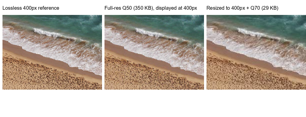
Here is the extreme case, zoomed in 4× at 400px display width — a 350 KB full-resolution file versus a 29 KB resized one:
Conclusions
- Decide the delivery width first. It's worth more than any quality setting: 800px is worth more than going from Q90 to Q50 ever will be (0.27× vs 0.77×).
- For the web, resize to (slightly above) display size, then compress. For a 2×-retina-safe margin, target ~1.5–2× the CSS display width. At matched displayed fidelity our measurements give the resized file a 40–70% size advantage.
- Keep the original for anything that might be reused — cropped later, printed, or viewed full-screen. Resize is lossy in a way quality sliders aren't: you can't re-widen a 400px image.
- The supersampling bonus is real but shouldn't drive policy: displaying an oversized image small hides artifacts — but you're still making every visitor download pixels that get thrown away. On mobile data, that's the wrong trade.
The one-sentence version: resolution is the cheapest thing to throw away and the most expensive to keep; quality is the reverse — so cut resolution first, then buy back quality with the bytes you saved.
Do Both in One Place
Our tools perform the same high-quality resize and the same browser-native compression measured here — locally, with no uploads: